

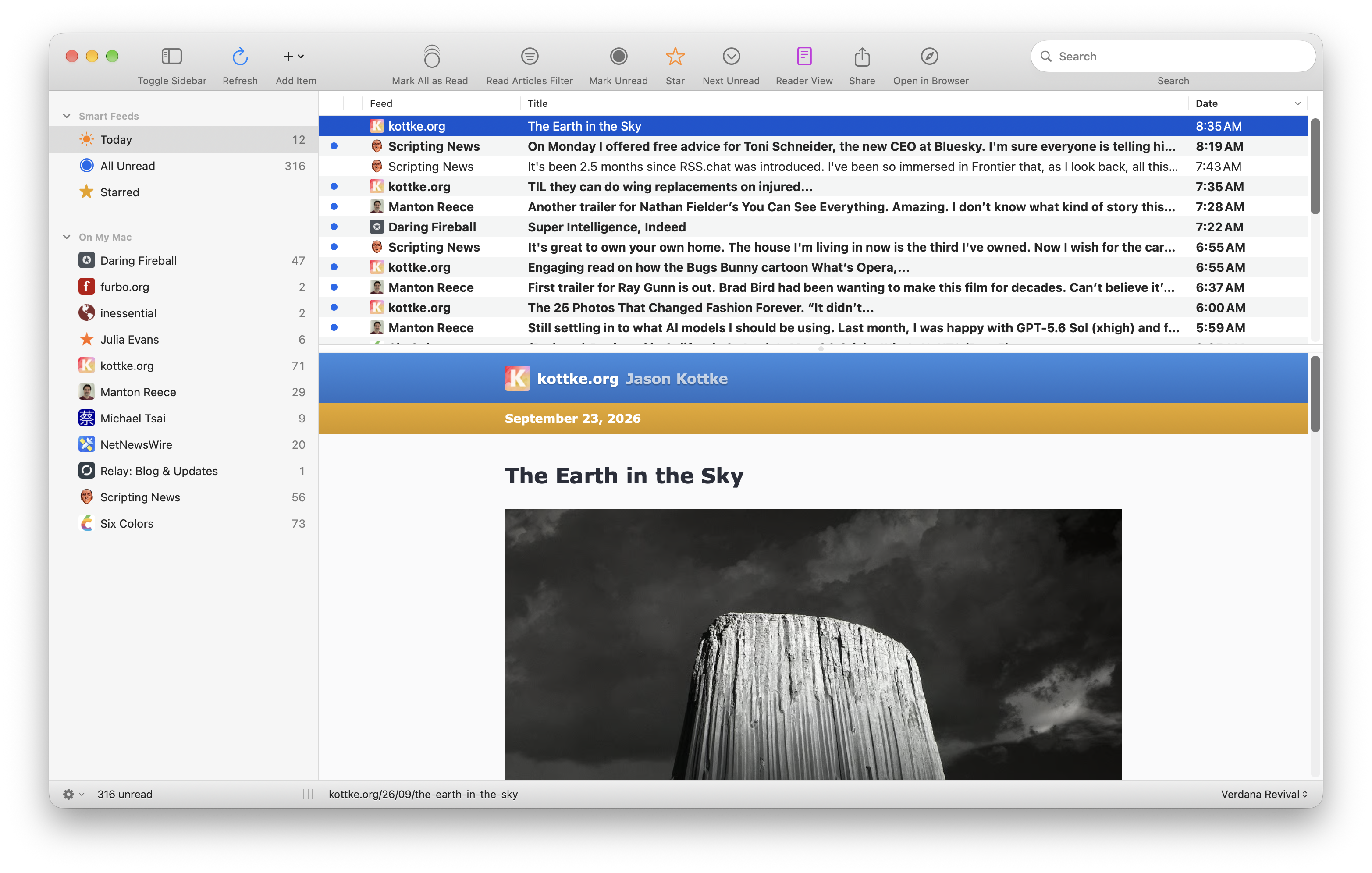
More messing around with non-Liquid-Glass ideas. Managed, with the help of @ccgus, to use an actual NSToolbar instead of a custom toolbar. Showing icon+text mode. Made the toolbar background Catalina-like.
0 Boosts
0 Likes


@brentsimmons @ccgus I know you’re just having fun, but this is how we smite Liquid Glass. By showing Apple that none of their defaults are worth it to any developer who wants to make a viable app. I hope you polish and release.






@brentsimmons @ccgus Yes! It looks even better with the toolbar item labels. Very clean, legible and I feel like it respects the user. The opposite of liquid glass.


@brentsimmons @ccgus Colour in toolbars… that brings me much more joy than I anticipated

@brentsimmons @ccgus just a drive-by 2¢: I think one of the key parts of having a great non-native-UI is to have a visual identity of your own, not just look like ‘developer hasn’t updated this in years’. With Things as one of your given examples, Things doesn’t look like macOS 10.15, it looks like Things. One big way to ‘do less work’ of course is to share your codebase across devices, and that doesn’t necessarily mean giving up native Mac UI… 😈
@stroughtonsmith @ccgus Absolutely right! On the way to that, though, I will look to inspiration from when macOS looked way cooler than it does now.
@brentsimmons @ccgus a style I liked but never caught on was this alternative Big Sur: https://dribbble.com/shots/15104809-Big-Sur-Mac-App



@brentsimmons that looks so good!

@brentsimmons @ccgus So good!