

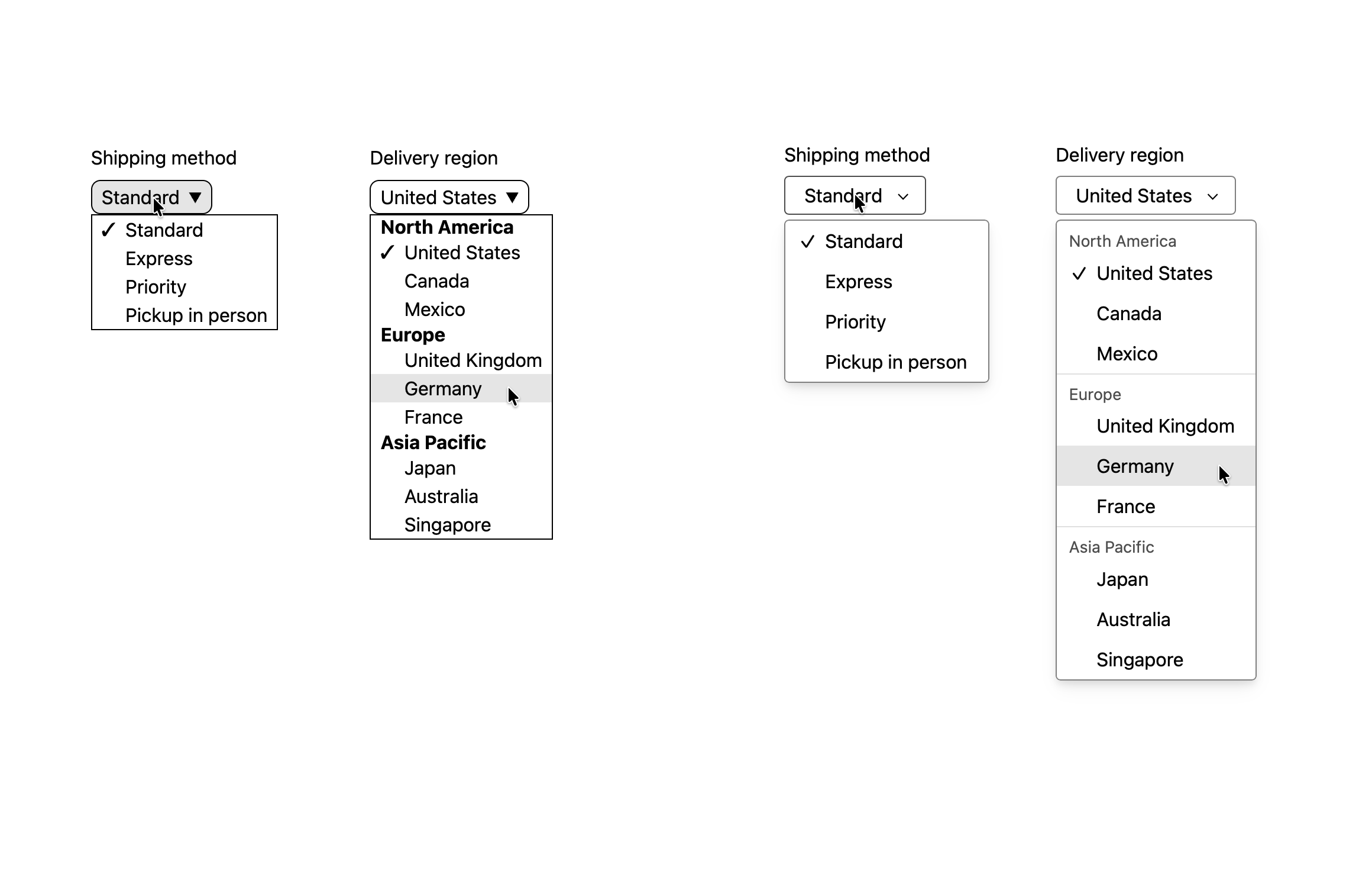
Previous default UA styling for Customizable `<select>` on the left. Current default UA styling in Safari 27 on the right. Thoughts? We really wanted to give web developers a better starting place. 30 years of struggling to style form controls is enough.
0 Boosts
0 Likes


@jensimmons Looks much cleaner with most of the essential styling already in place, ready for whatever theming needs to be applied.


@jensimmons I like how on the left, the categories (regions) are more prominent (bolded)
@jensimmons I also like the more compact layout of the left
@jensimmons what I like on the right is the font, the line of the box around the text is more subtle, and the menus seem more dimensional than flat.
@pgiulan The cool thing is it’s easy for you to change the styles. Wanted bolder group headings? Great. CSS can do that!


It looks heaps nicer!
That said - in 20 years industry work, much of it doing webdev, I've seen only a handful of admin forms use the browser default styles for <select>.
Essentially every project I've ever seen has a key stakeholder who views any variation in appearance between browsers as a defect.
To avoid variation between browsers, virtually every project includes a "reset" stylesheet, containing rules to override all known browser defaults with known-consistent values.
@knack This exactly the problem my team is on a mission to solve once and for all. Stay tuned.



@jensimmons is the
<hr>tag used in that last example? I don't think default UA styles should add horizontal rules to the option list unless an<hr>is actually in there.