The Mercator map projection keeps generating controversy, because it is completely fucked up. Greenland looks like it's the size of South America (it's about the size of Algeria). Antarctica looks like it dwarfs all of Eurasia (it's a bit smaller than Russia). Africa looks like it's a lot smaller than it actually is, and the centre of the world (at least longitudinally) is conspicuously Greenwich in England.
It has one redeeming feature (and all the aforementioned was *not* considered politically incendiary back in the 1500s!), and that is that a straight line on a Mercator map corresponds to a straight bearing on the actual globe. So it's incredibly useful for navigation - especially when this involved compasses and sextants and paper, rather than GPS trackers and satellites and computers.
But *because* it so greatly distorts the sizes of landmasses, it's probably not the best choice for eg. a school classroom world map, where it mostly creates misconceptions and its main quality has little use.
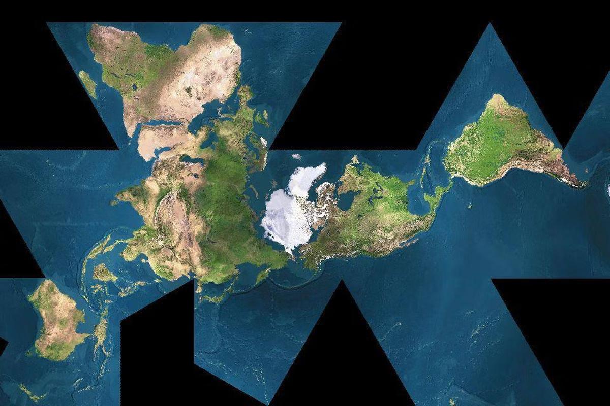
Here is my favourite alternative, the Dymaxion projection, which balances right on the knife edge between "utterly brilliant" and "batshit insane".