
RE: https://pdx.social/@louie/117161092161118640
Not fixed in Beta 8.
I know this seems like the TINIEST complaint, and it might be, but I need to say it because it’s driving me crazy.
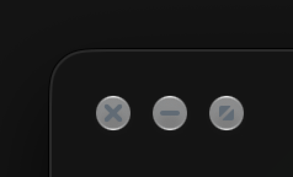
The symbol on the green stoplight control should be more saturated, slightly bluer, and darker than it currently is. (Top is current macOS Golden Gate beta, bottom is my edit.) Right now, it doesn’t match the color richness of the other two glyphs.