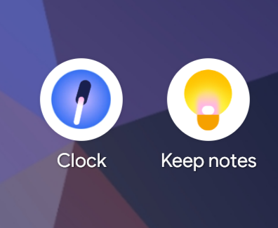
Google's brilliant "lay off all the senior people with taste and experience" plan is going swimmingly.
18
Replies
4
Boosts


@slightlyoff I'm not sure if I'm more confused by an eyedropper as a clock icon or the eyedropper itself being so misaligned.


It must’ve won a prize
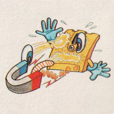

@slightlyoff 1995: Homer ordering a Tab via the tab key on his keyboard.
2026: Homer ordering a black licorice popsicle via an icon that inexplicably says "Clock" under it.

@slightlyoff It is clearly a top down view of a duck's head.


Nice! I didn't realize that the new Incredibles icon set was out!
Frozone could use a bit of work, but Syndrome looks great!

@slightlyoff I hate that new clock icon so much. Every time I unlock my phone, I think I have a bit of dirt or something on the screen before realizing that no, it's just the stupid hour hand on the awful new clock icon.

@slightlyoff birds eye view of cyclopean duck head


@slightlyoff so is it supposed to be a pacifier or a penis?
@slightlyoff Hey now. The lowest bidder worked _very_ hard on this.

@slightlyoff Android 5 is still probably my favorite UX/UI out of all of them. There might be features I like in other versions, but Android 5 on the Nexus 5 was 🤌🤌🤌


@slightlyoff they're ok depictions of lock picking and jaundice, I guess

@slightlyoff
Aha! So THAT’S where I put my eye drops.


@slightlyoff I use KISS launcher which allows me to use custom icons. I use the Arcticons icons hehe :)


This is better than ever single icon has the same color schema and is impossible to differentiate from any other icon... But it's not _good_. <3
@401matthall Ok, but these aren't icons that were previously blighted with that disease. Net regression.
Ah! Fair point.
Then without recourse I too add my voice to the dissent against garbage icons. <3