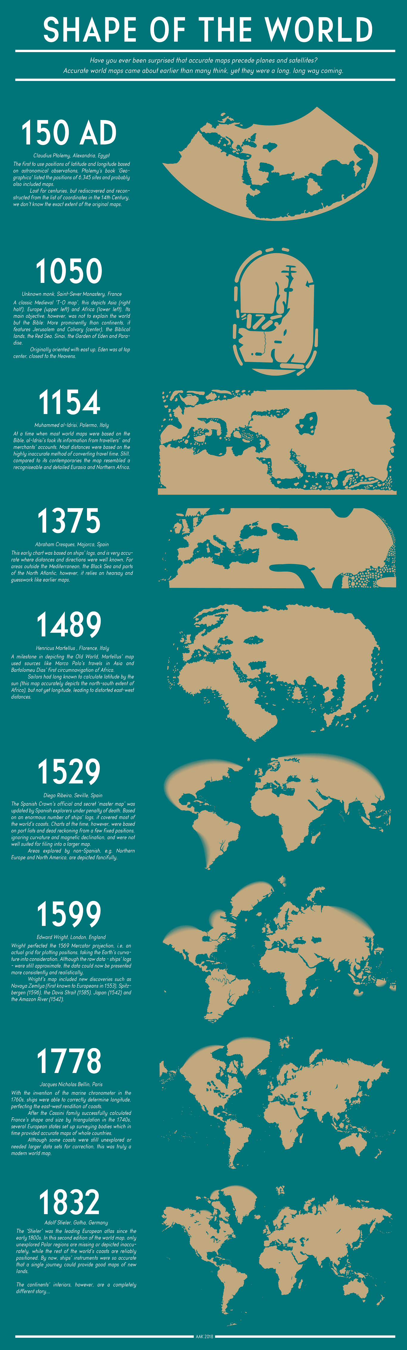
This infographic traces the evolution of world maps from **150 AD to 1832**, showing how humanity's understanding of Earth's geography gradually improved over nearly seventeen centuries. Each entry pairs a map with its creator, location and historical context. It begins with **Ptolemy's** map (150 AD), based largely on Roman and Greek knowledge, followed by the **Hereford Mappa Mundi** tradition around 1050, which mixed geography with religious symbolism. **Al-Idrisi's** 1154 map, created in Sicily, offered one of the most accurate medieval representations of Europe, North Africa and Asia. The 1375 **Catalan Atlas** incorporated growing maritime knowledge, while the 1489 map by **Henricus Martellus** improved Africa and Asia but still misjudged longitudes. The 1529 world map by **Diego Ribeiro** drew on Spanish and Portuguese exploration, producing one of the first scientifically informed global maps. **Edward Wright's** 1599 map introduced the mathematically correct Mercator projection, greatly improving navigation. By 1778, **Jacques Nicolas Bellin's** map reflected advances in surveying and longitude measurement, closely resembling the modern world. The final map, **Adolf Stieler's** 1832 atlas, depicts coastlines with high accuracy worldwide, though continental interiors remained less well explored. Together, the sequence illustrates that accurate world maps emerged through centuries of exploration, astronomy, mathematics, navigation and cartography, with each generation correcting errors and adding newly discovered lands until the familiar outline of today's world finally took shape.