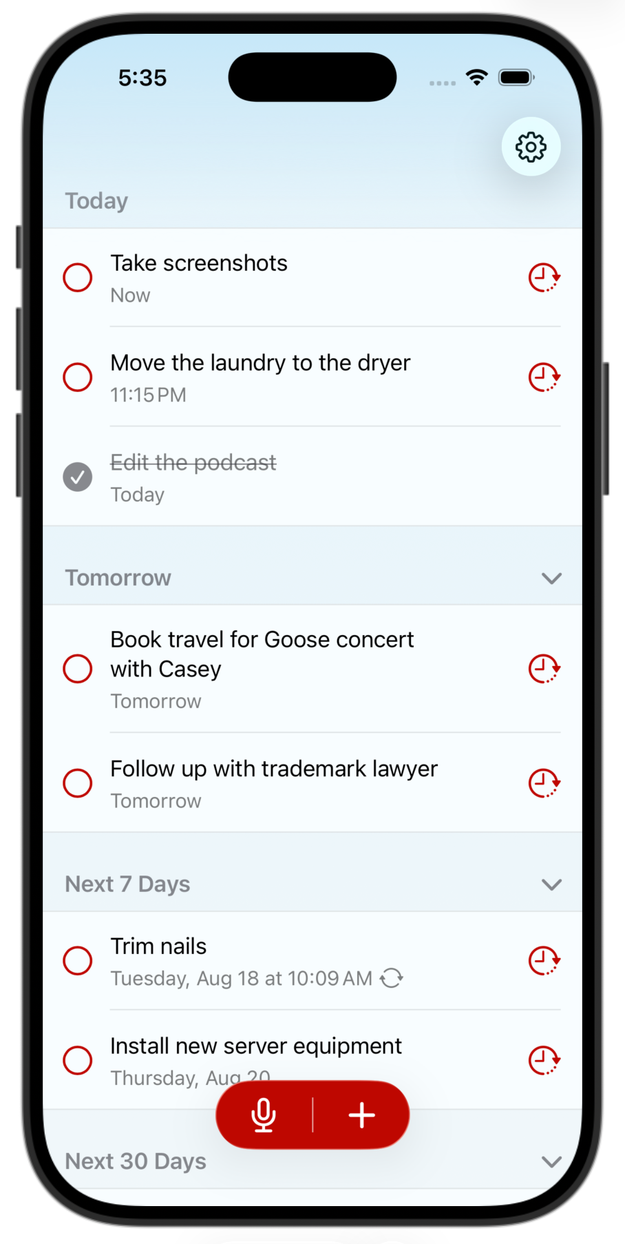

What do you think of moving the add/dictate buttons down to the bottom like this for better reachability? Lots of people have requested it.
My only hesitation is that the accent color looks pretty bold down there. But other designs — translucent bars behind, white buttons, etc. — all look significantly worse or more jumbled.
In use on a real device, I think it looks less in-your-face than it does on a screenshot on a Mac.