
Erik Marinovich and Lucas Sharp’s new Rotina is very fun: https://www.sharptype.co/typefaces/rotina I like how Erik brings his lettering instincts into his type design.
The Swash, a refined improvement on 1970s Helvetica & Univers Flairs (https://fontsinuse.com/typefaces/162406/univers-flair), is what the promos feature most, but the Script – a cursive/italic hybrid – is what makes this design special. The only thing kinda like it is Commercial Type’s Control Cursive (https://commercialtype.com/catalog/control/control_cursive_vf), inspired by Van Dijk (https://fontsinuse.com/typefaces/3539/van-dijk).
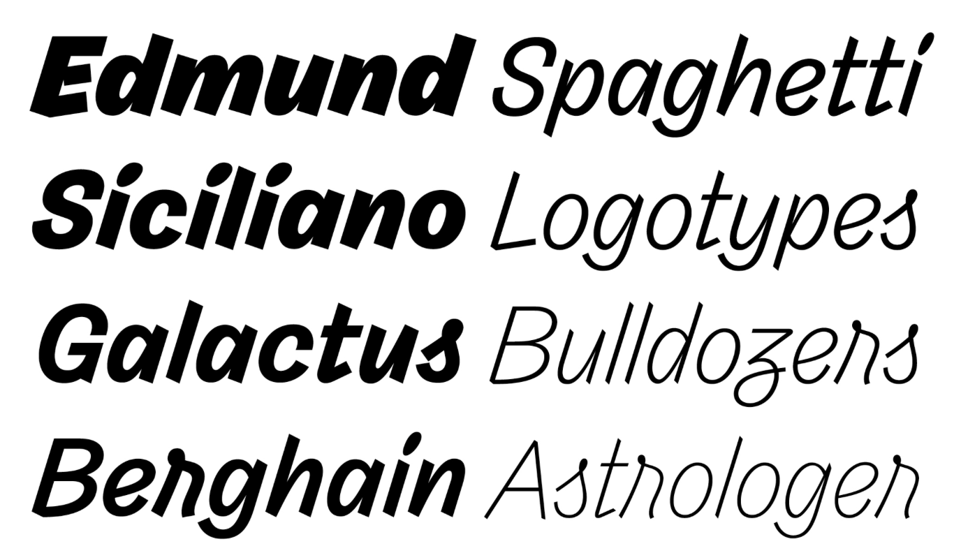
Control Cursive. Specimen of an italic sans serif typeface in 8 weights. Some letters (S, a, g) have a cursive shape.
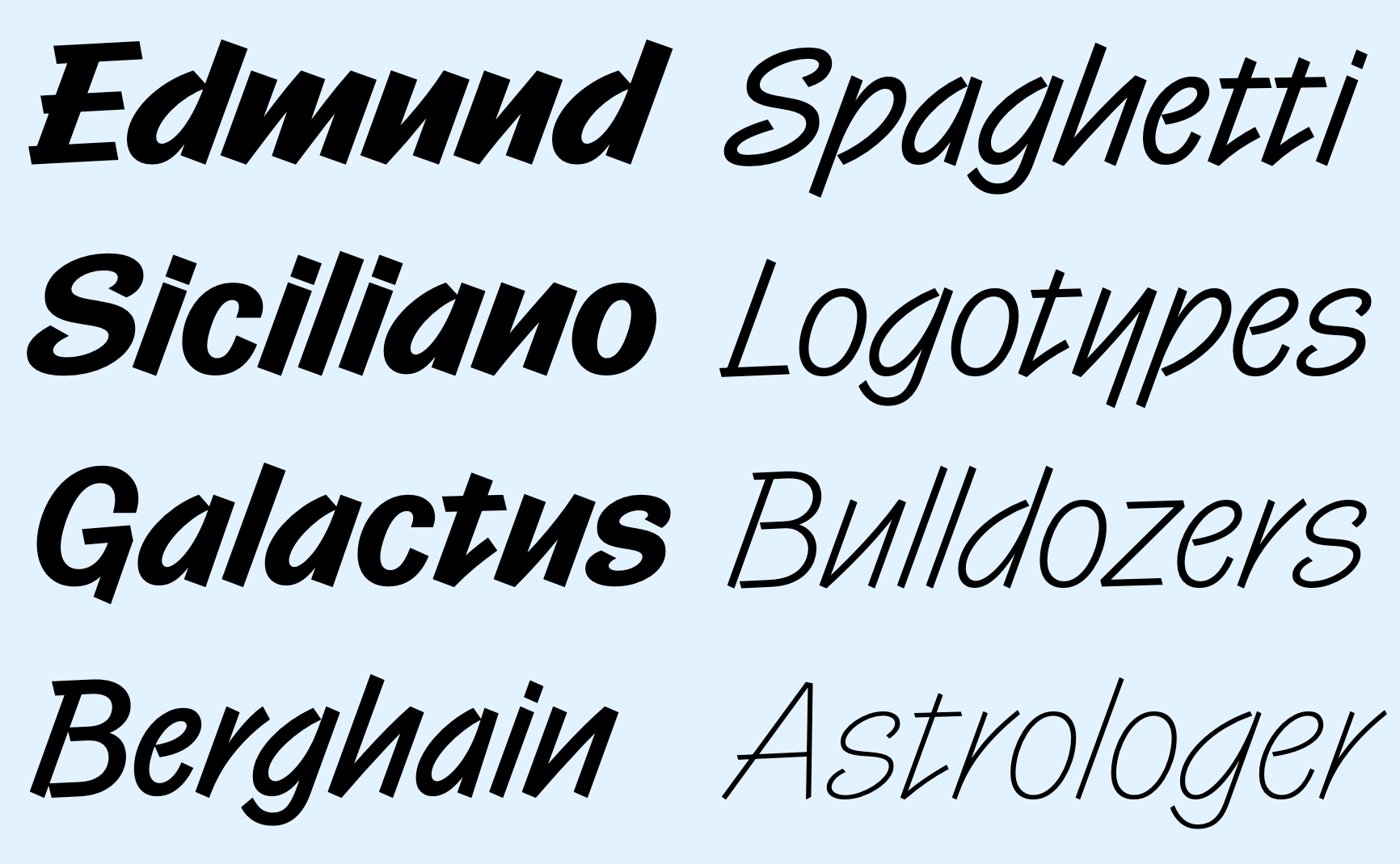
Rotina Script. Specimen of an italic sans serif typeface in 8 weights. Some letters (r, z, s) have a cursive shape.
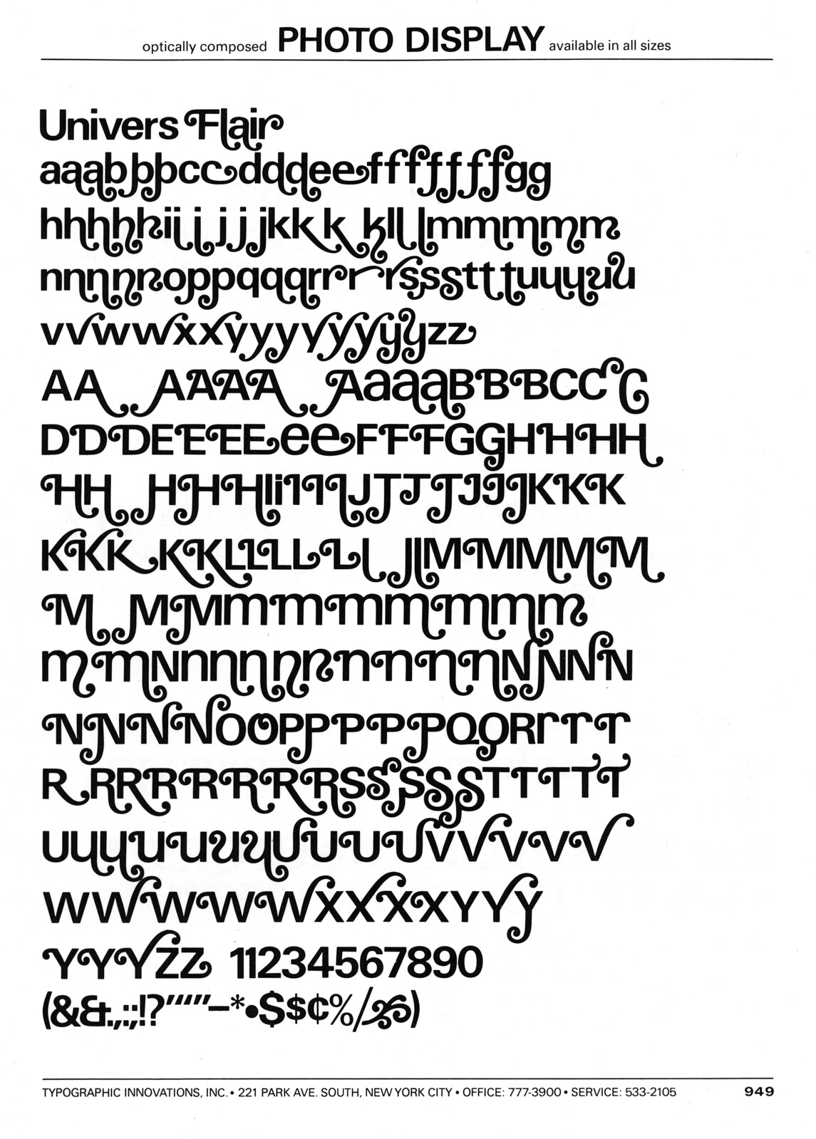
Univers Flair. Specimen of a glyph set for a neo-grotesque sans typeface with many swash alternates.
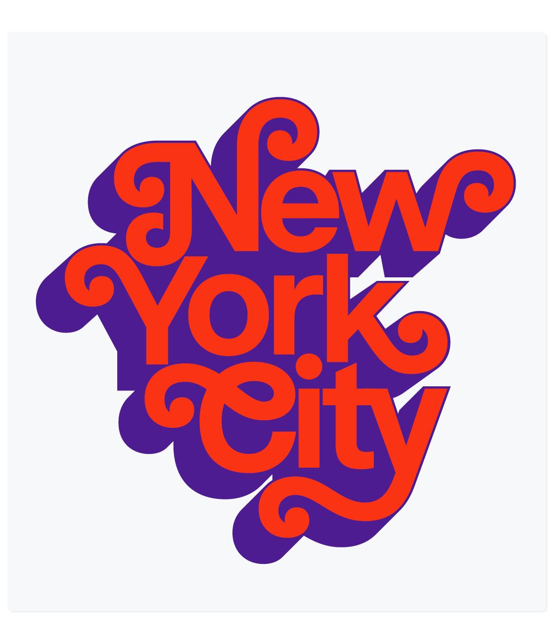
Rotina Swash. “New York City” logo set in in red with a purple 3D shade. The type is a neo-grotesque sans with swashes on caps and ending letters.