Discussion
Loading...

Post

  • About
  • Code of conduct
  • Privacy
  • Users
  • Instances
  • About Bonfire
Peter du Toit
@peterdutoit@mastodon.green  ·  activity timestamp last month

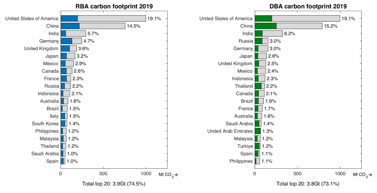
"Tourism carbon footprints were calculated using both residence-based accounting (RBA) to attribute emissions to the countries of visitor origin and destination-based accounting (DBA) for countries where tourism expenditures takes place."

Grey = domestic travel footprint
Green = inbound tourism footprint
Blue = outbound tourism footprint

Notice anything?

Paper: Drivers of global tourism carbon emissions https://www.nature.com/articles/s41467-024-54582-7

#ClimateCrisis

RBA measures emissions resulting from residents’ domestic and outbound travel, while DBA measures emissions from domestic and inbound tourism activities occurring within a country. The domestic travel footprint is represented in grey, the inbound tourism footprint in green, and the outbound tourism footprint in blue.
  • Copy link
  • Flag this post
  • Block
Jonathan Schofield
@urlyman@mastodon.social replied  ·  activity timestamp last month

@peterdutoit interesting study. A pity that the raw data for that chart is not accessible (that I could see).

e.g. I infer that, at 3.6% of 3.9GT, the UK’s outbound tourism amounts to ~140 MT, but that must be just the blue bit, so the grey domestic bit can only be guessed at. But that assessment doesn’t look quite right relative to the x-axis.

It would be better if the grey bit was integrated with both blue and green in a single chart and that the data is inspectable.

  • Copy link
  • Flag this comment
  • Block
Log in

bonfire.cafe

A space for Bonfire maintainers and contributors to communicate

bonfire.cafe: About · Code of conduct · Privacy · Users · Instances
Bonfire social · 1.0.0-rc.3.13 no JS en
Automatic federation enabled
  • Explore
  • About
  • Members
  • Code of Conduct
Home
Login