Discussion
Loading...

Post

  • About
  • Code of conduct
  • Privacy
  • Users
  • Instances
  • About Bonfire
Matt Godden
@metaning@mastodon.social  ·  activity timestamp 2 months ago

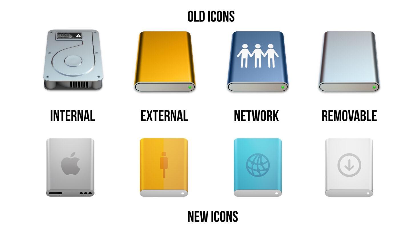
What's so pathetic about this redesign of the #macOS drive icons from #Apple isn't that it ditches #Skeuomorphism, it's that it hangs on to skeuomorphism by trying to show a non-euclidian geometry vision of the face of a desktop drive.

Apple lacks the #Courage to go full geometric primitive and make icons that are pure metaphor. Given they're cargo-culting their own graphical history in so many decorative ways, they could have made uncompomised high-fidelity takes on the pre-Aqua icons.

A comparison between old, and new Mac OS icons for hard drives, and network shares.
  • Copy link
  • Flag this post
  • Block
Log in

bonfire.cafe

A space for Bonfire maintainers and contributors to communicate

bonfire.cafe: About · Code of conduct · Privacy · Users · Instances
Bonfire social · 1.0.0-rc.3.13 no JS en
Automatic federation enabled
  • Explore
  • About
  • Members
  • Code of Conduct
Home
Login