Discussion
Loading...

Discussion

  • About
  • Code of conduct
  • Privacy
  • Users
  • Instances
  • About Bonfire
Jonathan Schofield
@urlyman@mastodon.social  ·  activity timestamp 2 weeks ago

This week’s https://en.writes.casa/en theme is “Maps to nowhere”.

My #degrowth surveying submission follows…

Latest Writings - writes.casa

  • Copy link
  • Flag this post
  • Block
Jonathan Schofield
@urlyman@mastodon.social replied  ·  activity timestamp 2 weeks ago

…1/3

Steep gradient ahead.
Select low gear.

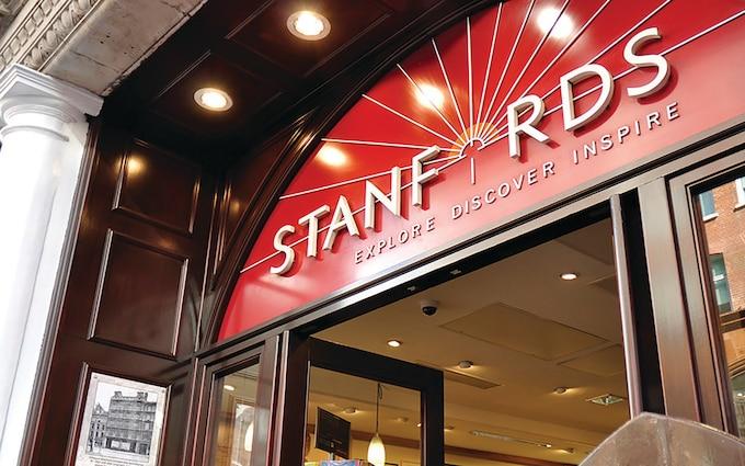
When I was young there seemed to be a map to where I was going. In my first years forging a design career in London I’d go to Stanfords in Covent Garden and pore over their printed and 3-D relief maps of thousands of somewheres I could go.

But from the mid 2000s, mapping began to change…

A graphic sunrise provides the backdrop to and the sun at its centre the letter ‘O’ of the Stanfords red sign on the entrance to its now defunct Long Acre store in London’s Covent Garden. The sign formed a semi-circle above a wood-panelled doorway, with lettering and sun rays picked out in white in relief.
  • Copy link
  • Flag this comment
  • Block
Jonathan Schofield
@urlyman@mastodon.social replied  ·  activity timestamp 2 weeks ago

…2/3

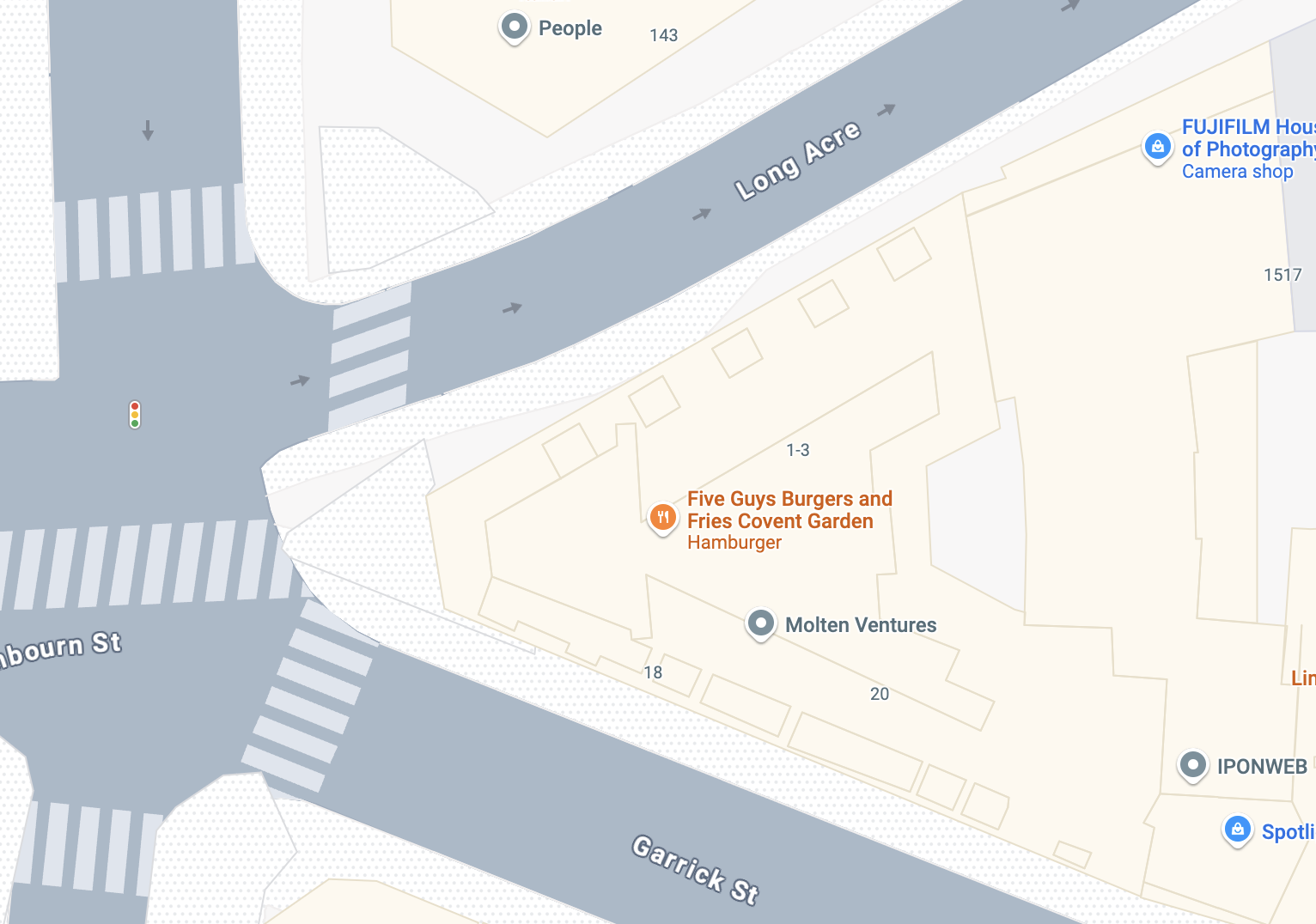
Searchable, zoomable, draggable digital maps became the thing. And two decades later more than a billion questions are asked of them every month. Questions that rely upon satellites put into space on rockets built with fossil fuels that can’t go on.

Some maps haven’t changed at all. GDP is a map of financial growth, or the lack of it. A map that’s imaginary because it ignores the landscape it sits within…

A Google Map rendering of the former location of Stanford Maps, at the intersection of Long Acre and Garrick Street, now Five Guys Burger and Fries, Covent Garden.
  • Copy link
  • Flag this comment
  • Block
Jonathan Schofield
@urlyman@mastodon.social replied  ·  activity timestamp 2 weeks ago

…3/3

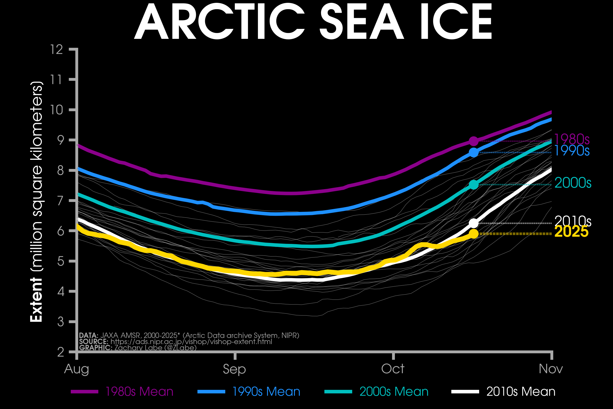
As our economic solid ground slips away, dataviz of ice loss maps the data we’re now swimming in. Swimming or drowning?

There are no shortage of maps to places we cannot go, and to places we’ll not want to go. And too few of where we might like to. Such are the contours of our lives.

#degrowth

Zack Labe’s visualisation of the decadal mean of loss of arctic sea ice since the 1980s. Coloured lines for each decade portray the months of lowest extent from August to October, with the lowest point tending to mid-September.  The extent has gone from around 7.2 million square kilometres in the 1980s to 4.4 million in the 2010s. A yellow line for 2025 so far shows a lower extent thank the past decade for early August and mid October but a slightly higher minimum in September.
Zack Labe’s visualisation of the decadal mean of loss of arctic sea ice since the 1980s. Coloured lines for each decade portray the months of lowest extent from August to October, with the lowest point tending to mid-September. The extent has gone from around 7.2 million square kilometres in the 1980s to 4.4 million in the 2010s. A yellow line for 2025 so far shows a lower extent thank the past decade for early August and mid October but a slightly higher minimum in September.
  • Copy link
  • Flag this comment
  • Block
Log in

bonfire.cafe

A space for Bonfire maintainers and contributors to communicate

bonfire.cafe: About · Code of conduct · Privacy · Users · Instances
Bonfire social · 1.0.0-rc.3.21 no JS en
Automatic federation enabled
  • Explore
  • About
  • Members
  • Code of Conduct
Home
Login