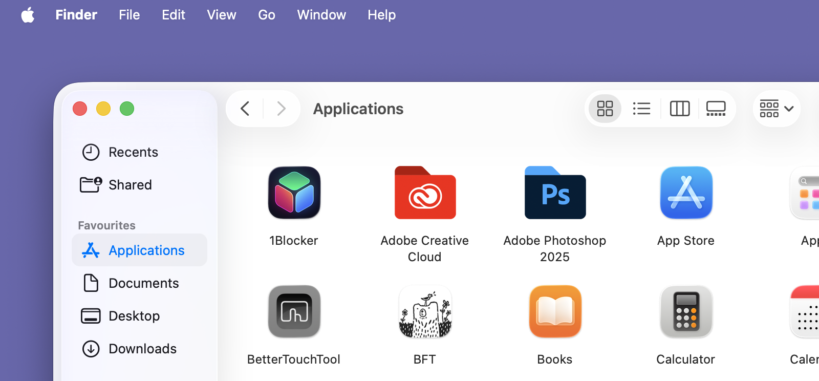
I just don’t get this design. At all. The eye is distracted by the drop shadows, which lift the sidebar and buttons ‘above’ the content (ie the icons) and the title of the window. From a visual hierarchy standpoint, it makes no sense.

The menu bar also just feels weird without a background. I suppose we should count ourselves lucky Apple hasn’t forced the iPad version on us, because that’s even worse. (And, yes, I know you can – for now – bring the background back.)
@craiggrannell

Well, the reason for that is simple:

That design by #Apple is just shit. Garbage.

No sane user interface designer would dream of something as ugly and hard to use as this.

And the obscene giant rounded rects for the windows, removing so much screen estate. And for what? What wet dreams did Alan Dye have for this?

#macOS 26 is the first #Apple OS with a negative usability.

It is just utter bullshit. 🤮 🤮 🤮 🤮 🤮

And what is more, Apple had already tried the idiotic "no background menu bar" a couple of years ago, and the users hated it, so they quickly got rid of it.

A company that is unable and willing to learn is doomed.
And arrogant.