

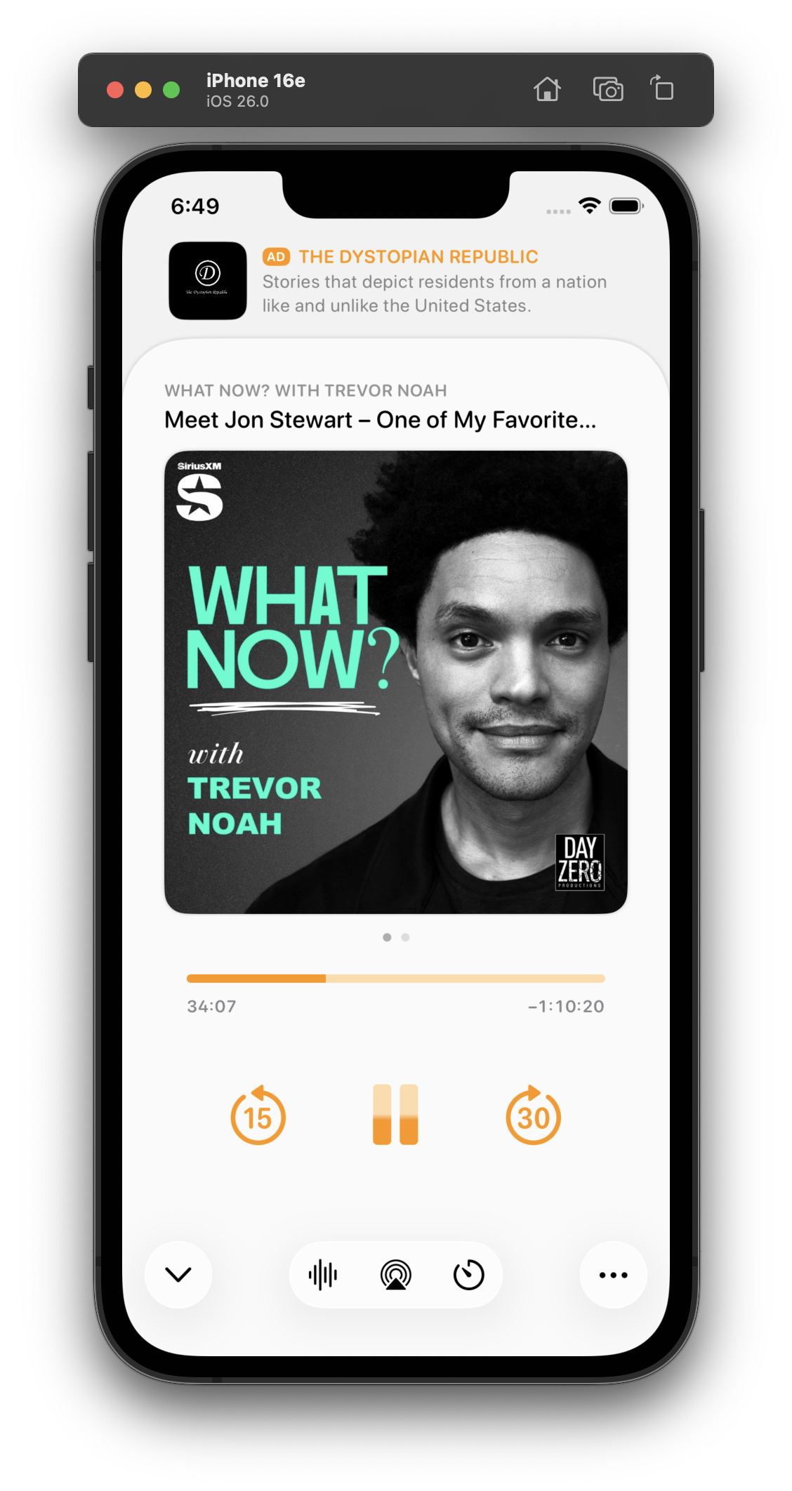
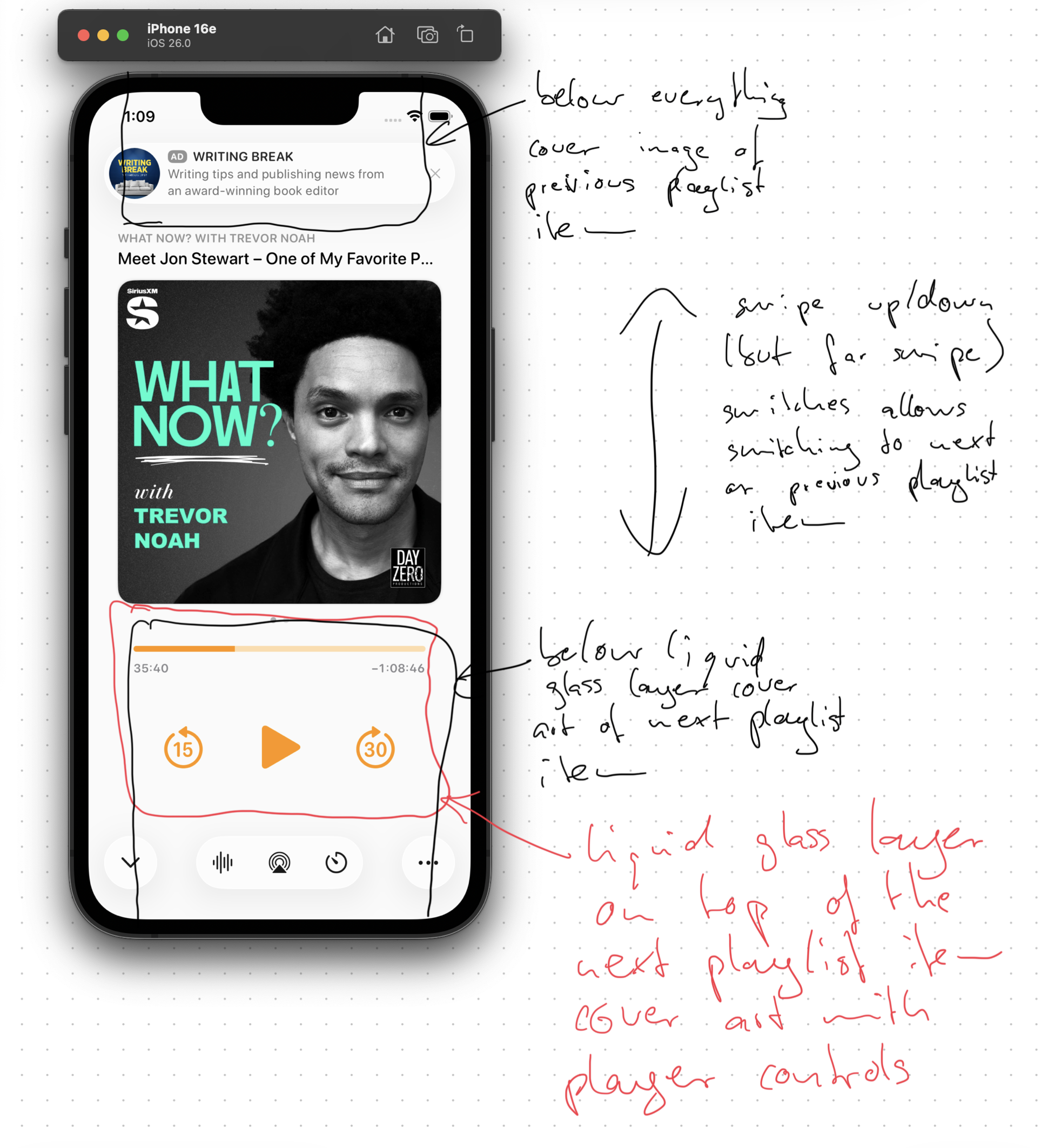
I played with this wild idea a bit for a top ad. I don't think I like it, but I'm glad I tried it.
Discussion
Loading...

@marcoarment FWIW they were all beautiful!
@marcoarment I'm not a programmer or a UI designer… but could you put the controls in a floating glass capsule?

@marcoarment that’s actually my favorite of the lot.
Everyone loves this one! I did, too, as a screenshot. But I build and use all of my designs to test them. This one’s downsides:
- It confuses the sheet-presentation metaphor
- When swiped to the show notes, it creates 3 levels of card depth, which is cluttered and doesn't fit the 26 design
- It needs a lot of vertical padding, which pushes the playback controls quite far down
This is why I build and live with my designs. I wouldn't find these tradeoffs in mockups or screenshots alone.


@marcoarment yet to see a posted design of yours that I hate. Prefer some over others but none suck.
You’re right tho. It’s different using vrs a screenshot
If only Dye recognised that.
@marcoarment Apple designers would have stopped at the design looking good in mockups.


@marcoarment I think the one you showed the other day with the simple divider line between them was the best one.
@marcoarment Yeah I like the look of that version, but when you think about it, it’s making the ad look like the permanent content while the podcast looks like a card that’s temporarily slid up in front of it.

@marcoarment, what if, instead, the ad is on a black background, as if the sheet doesn’t reach the top and whatever was behind faded to black, leaving space for the ad?

@marcoarment Lower play buttons would be easier to reach IMO


@marcoarment I think my reaction to it is the same as yours:
The big problem for me with this design without actually physically using it (always a different perspective to a static image) is that it implies that the advert is the primary content, and that the content overlaying it it's a secondary slide over. In other words, the actual primary content (the player) is the one that gets dismissed to leave the ad if you ever swipe down.
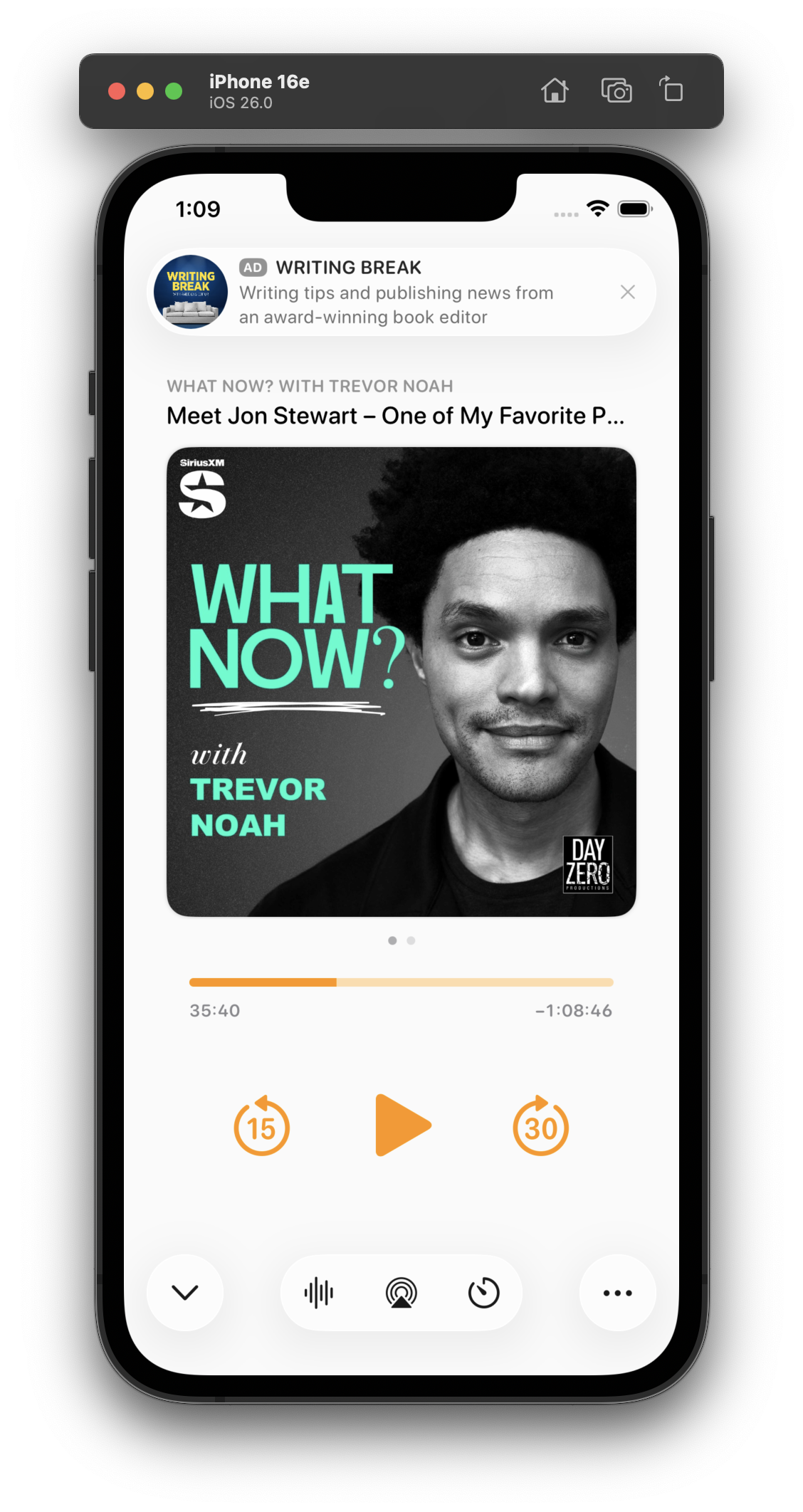
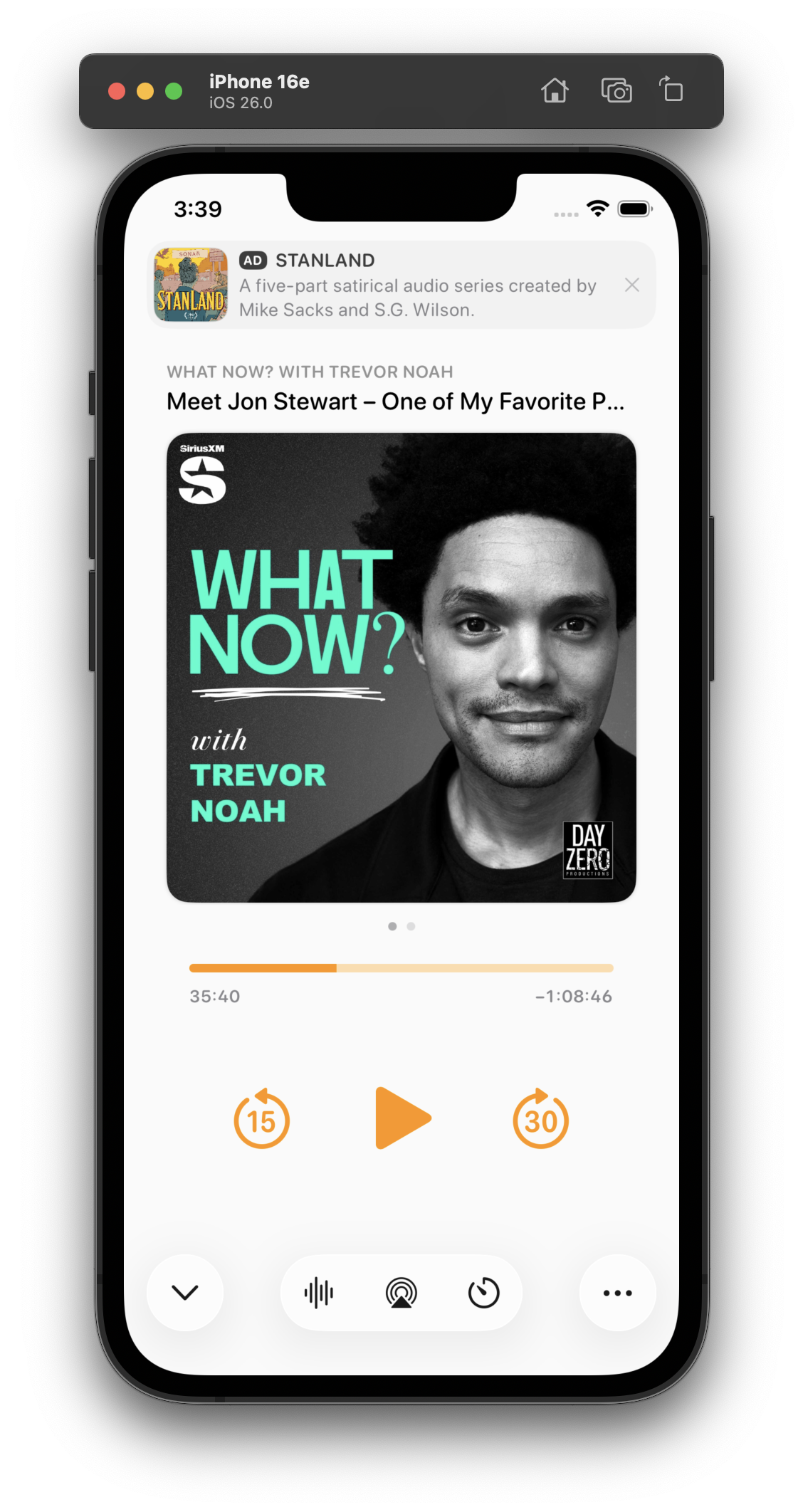
I've been using this design today. I think it looks great in screenshots, and improves a lot of those issues, especially in show-notes view (which lets the content scroll under the glass ad capsule).
In practice, though, it has a fatal flaw:
It always looks like I have a notification. And that's very distracting when it's sitting on a counter as I do stuff and I see it out of the corner of my eye.
Which I never would’ve realized until I lived with it on my phone for half a day.


@marcoarment is putting the ad between the title and the image an option? or does that interrupt the main information of the episode to much?
@marcoarment Liquid Glass looks kind of boring and white without background 😐 For me one of the bigger downsides of this design. Not every interface will have floating content beneath.

@Kerry@mas.to
replied
·
activity timestamp
3 weeks ago

@marcoarment I think this is your best option, unfortunately. Keeps the ad out of the wasteland in the middle and out of the bottom.
Trying this variant for the second half of the day. It's less notificationey.
(I tried a border around the ad, but that doesn't fit 26's style and immediately looks old in context with the rest of the OS. And the low contrast between the backgrounds is, in this case, actually an upside — it makes it look less like a notification. I'm about 75% satisfied with this.)

@marcoarment Had you considered making the entire ad space (and above) black so it appears almost separate?

@marcoarment you don’t prefer the main design language of the toolbar in bottom left with a ••• and the primary action (chevron) bottom right?


@marcoarment I’m sure this is a dumb question but - did you ever consider making the playback controls Liquid Glass?

@marcoarment What if you made the ad “dark mode” and integrated it into the status bar/ Dynamic Island area, making it look like the app starts slightly lower?
@marcoarment I’m not in love with how the bottom controls don’t have labels. It’s hard to tell what they are at a glance.
(And yes, I’m aware that the current design has this issue too)

@marcoarment My wife says “I dunno, they all looked good to me. I’m sure Marco will make a good choice.”

@marcoarment Have you tried applying some sort of floaty drop shadow aesthetic to the transport control buttons, too? It feels like they should visually be on the same layer/level as the liquid glass bottom buttons.


@marcoarment The reason why i like the the idea of the ad on the the top is because the player controls are on the bottom. The user won’t accidentally trigger the ad this way.


@marcoarment Does this work well on an iPhone mini?


@marcoarment it’s definitely the best revision you’ve come up with so far. Ads in Overcast were so thoughtfully designed to be unobtrusive, but being at the top of the screen it tends to keep drawing my attention in an unpleasant way. Don’t envy your decision making process 🍺


@marcoarment have you considered moving the podcast title lockup below the artwork? It would be less busy up there where the ad meets the title.
@marcoarment I like the utility of the sheet dismiss button being at the bottom of the screen. Can you still swipe down on the sheet to dismiss it though?


@marcoarment any of these styles from Phone provide some ideas?
(By FAR, the most time-consuming part of Overcast's design has always been the now-playing screen. You can see why it's so complicated!)

@marcoarment and yet after years of using it, I still find it confusing.
Labels would help me a lot.

@marcoarment I’ve got an audiobook application and share the same thoughts. My app needs a bit of a deeper refresh than Overcast did and I’m dreading the now playing screen.

@marcoarment I honestly appreciate the insight into the design thought process. Cool to watch it iterate.


@marcoarment Wouldn't the proper liquid glass-hole thing to do be to place the play/pause and skip buttons all shiny and clear over the artwork? #HalfKidding
@marcoarment what’s the Alan Dye button for?
It feels off to me to have some buttons be the new UI and some the standard Overcast buttons.

@marcoarment design idea - what do you think of this?

@marcoarment I think that’s the biggest flaw of the entire Liquid Glass design philosophy. It claims to get out of the way of your content but the shininess of it actually catches your eye and draws it away.
@marcoarment That makes sense indeed. On the other hand, the bottom part of the screen is easiest to reach with the Thumb and such, especially on the iPhone Max models…
So it would make sense to assign the bottom half of the screen to useful buttons etc. ?
So it would make sense to assign the bottom half of the screen to useful buttons etc. ?
@marcoarment Oh wow it really does doesn’t it.

@marcoarment What if that same ad style went between the cover art and the progress bar? Or between the progress bar and player controls?

@marcoarment tbh, the „ad at the top“ placement to me makes this whole screen feel… cheap? Idk why or what it is, but I really, really prefer it anywhere else. I suppose because it’s the first thing I see when looking at the screen(shot)? Using it could be way different though

@marcoarment I think the now playing screen doesn’t need any Liquid Glass buttons except for maybe the “minimize” toolbar button in the upper left.
I think your existing screen would look good as is within a redesign. I would focus on the layer below with a search tab bar, accessory view for the mini player and updated navigation bar. My 2 cents. 🙂


@marcoarment Have you tried putting the ad between the podcast title and the podcast artwork? Then when sliding to the show notes, the title and the ad could be static and the show notes could slide in. The date of the episode on the show notes screen would be in the way, but this might give you the best of both worlds.
Might look terrible, but it might fix the persistent notification look


@marcoarment "looks like I have a notification" is the reason I voted for putting it at the bottom. Many people like notifications, but no one wants ads that fool them.

@marcoarment mmm I think people would just get used to it unless maybe it has some visual indicator.


@marcoarment oh that IS GOOD!
@marcoarment This could be the most beautiful, unobtrusive ad I’ve seen! 😎
@marcoarment
What don’t you like about it?
What don’t you like about it?

@marcoarment I like it!


@marcoarment That looks great! It doesn’t distract from the player view. To be honest, I like this more than your three examples from earlier.

@marcoarment weirdly I prefer this to option 3 and Bens amended designs 😅
If you were going with the top ad banner placement this could offer potential enhancement later with initiating Overcast Premium
If you were going with the top ad banner placement this could offer potential enhancement later with initiating Overcast Premium
@marcoarment I like it

@marcoarment I also like this one the best. Not sure about the layering (shouldn't the ad be on the same layer as the cover art), but the down arrow in lower left is the key for me here. As a right handed max phone user, I love the reachability.. top left controls are always a thumb workout.

@marcoarment what if you made the background behind the ad black 🤔
@marcoarment I mean, paying so I won't see this but this one is my favorite so far. Keeps the controls in thumb range like some of the other ad-on-bottom designs, but this one isn't going to have as many accidental taps.
@marcoarment I just don’t like the floating bottom middle toolbar. See the music app. Apple doesn’t do this on their player.
@marcoarment it’s a weird thing - with controls mostly moving to the bottom, you’d think the top was a natural place for an ad, but I think because top ads still feel like junk web banners, it seems wrong up there. UI is mysterious.
@marcoarment that’s much better

@marcoarment Personality… I like it up there cause it’s out of the way for controls and stuff. But… depending on the terms you might have value in accidental clicks. (Not your terms, but industry in general)

@marcoarment Looks great to me. I'd go with this one.

@marcoarment Actually, I think that’s kind of nice. I’ve always responded to app designs that felt like layers of substrate being revealed /exposed / hidden, etc.

@marcoarment It may feel so good because there is this concept of hierarchy and layers, and the ad’s in the background while the app’s main content is right in front. It feels respectful to me as a user.


@marcoarment this is definitely best so far
@marcoarment I really like this, it somehow feels “well-designed”. But I would expect being able to drag down the card.
@marcoarment Totally fair, but it does look very nice.
What about combining that with what you did earlier where the ad was at the bottom of the screen?
I like the “sheet below a sheet” effect.

@marcoarment This is my favorite too. Very clear distinction between what is related to the current episode and what is not.
@marcoarment My wife likes this one the best. I don’t get ads in Overcast, so I asked her.

@marcoarment I kind of like it on the top of the screen. It takes it out of an accidental tap zone at the bottom of the screen, and gives ads more prominence without distracting too much.


@marcoarment O actually do like it! 😬
@marcoarment this is a pretty good solution layout wise. Clearly separates the content from the ad.
The space could lend itself to be quite playful. Eg. if you try to swipe the “sheet” up over it you can trigger messaging to prompt subscribe to remove ads— or down the sheet to half detent, could reveal the subscription messaging/options below the ad.
Could also become annoying and not feel right over time— but might be worth experimenting with the space / interaction to see if it has legs.


@marcoarment I agree with several other people, the ad on the top looks pretty good.
@marcoarment yeah, this is my favorite so far!
@marcoarment I think that looks great.

@marcoarment doesn’t look bad, but absolutely get it. The rest looks awesome though.
@marcoarment in this configuration, I like how if a notification comes in, it’s not going to cover any of the content area of the app

@marcoarment I don’t know, that looks pretty amazing to me, but does it make conceptual sense? What’s underneath the now playing screen?

@marcoarment That’s far better than your earlier options. Clean, clear separation from content, but prominent.

@marcoarment I think having it at the top is a lot better
bonfire.cafe
A space for Bonfire maintainers and contributors to communicate
Automatic federation enabled